Creating layouts with CSS Grid and CSS Flexible Box Layout
Best from both worlds
Flexbox and CSS Grid saved the web. Too long we have been going with float and clearfix hacks or things that combine these like Jeet grid system.
I find myself using both flex and grid. Flex useful for simple layouts where we only need to align for instance two elements to the sides like logo to left and navigation to right. Here’s an example of the most used two lines in my layouts:
display: flex;
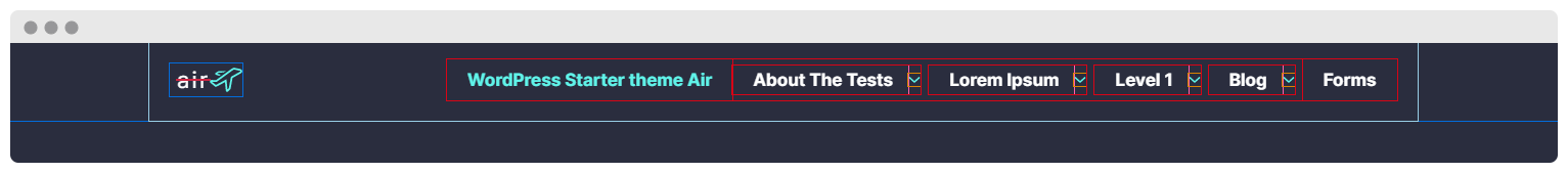
justify-content: space-between;This is useful in layouts that don’t have “fixed” widths, like navigation on desktop:
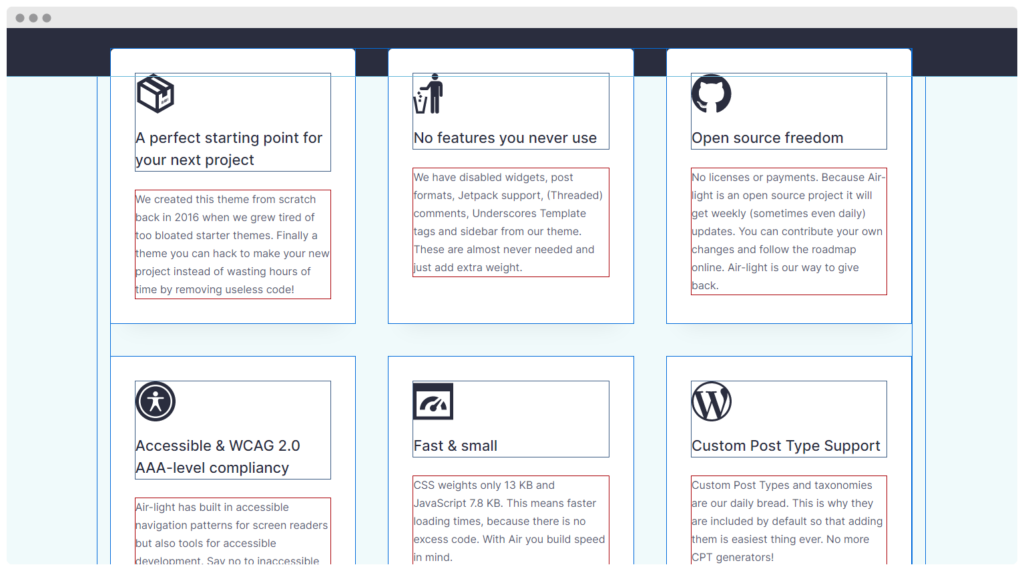
Whereas CSS Grid comes handy in elements like this:
For these I have a handy mixin that I use in every web project I’m involved in:
@mixin grid($columns, $max_width: 1fr, $min_width: 0, $min_height: 0, $max_height: auto, $gutter_x: 16px, $gutter_y: 16px) {
  display: grid;
  grid-auto-rows: minmax($min_height, $max_height);
  grid-column-gap: $gutter_x;
  grid-row-gap: $gutter_y;
  grid-template-columns: repeat($columns, minmax($min_width, $max_width));
}
It’s really simple to use if you need columns with equal widths:
.columns {
  @media (min-width: $container-ipad) {
    @include grid(3);
  }
}
Makes the coding even faster when you have this in your vscode scss.json snippets to be able to just type grid + tab to produce the whole snippet:
{
  "CSS Grid": {
    "prefix": "grid",
    "body": [
      "@include grid(${1:3}, \\$gutter_x: 50px, \\$gutter_y: 50px);",
    ],
  },
}
If you need different kind of columns you can just use the simple CSS like so:
.columns {
  display: grid;
  grid-template-columns: 194px 2fr;
  grid-gap: 50px;
}
Mistakes can be made when using CSS grid fast and not mobile first. The most common mistake for me personally is just creating columns without checking twice their dimension flexibility.
For example in the example above we have left column fixed with and right two fractions:
grid-template-columns: 194px 2fr;If right side has long text, for example pasted link, it will break because it will stretch the longer side.
The solution is to define min to zero and max to 2 fractions:
grid-template-columns: 194px minmax(0, 2fr);
How beautiful is that?
 @rolle